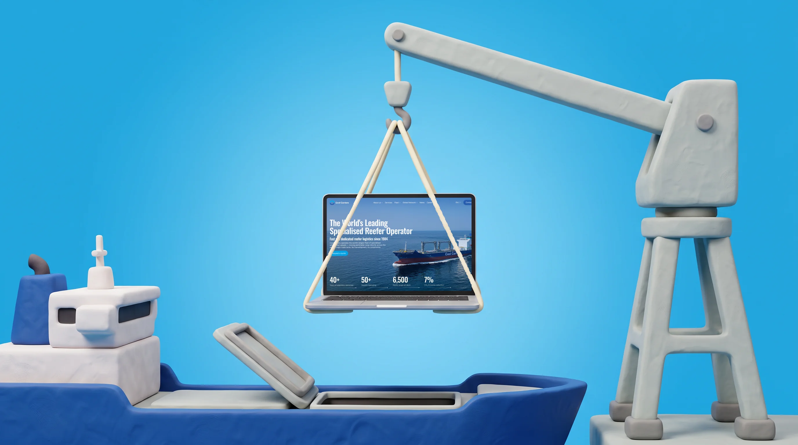
50 Reefer Vessels, One Website in Two Languages
We developed a single bilingual corporate website for Cool Carriers to replace its regional sites.


Client & Context
Cool Carriers is a reefer shipping company. Its 50-vessel fleet carries fruit, vegetables, meat and fish in refrigerated holds.
The company's history goes back to 1984. Offices operate in Cyprus, Sweden, Chile, New Zealand, USA and South Africa.
Regional websites looked outdated and didn't reflect the company's scale. The new Managing Director wanted one global site.
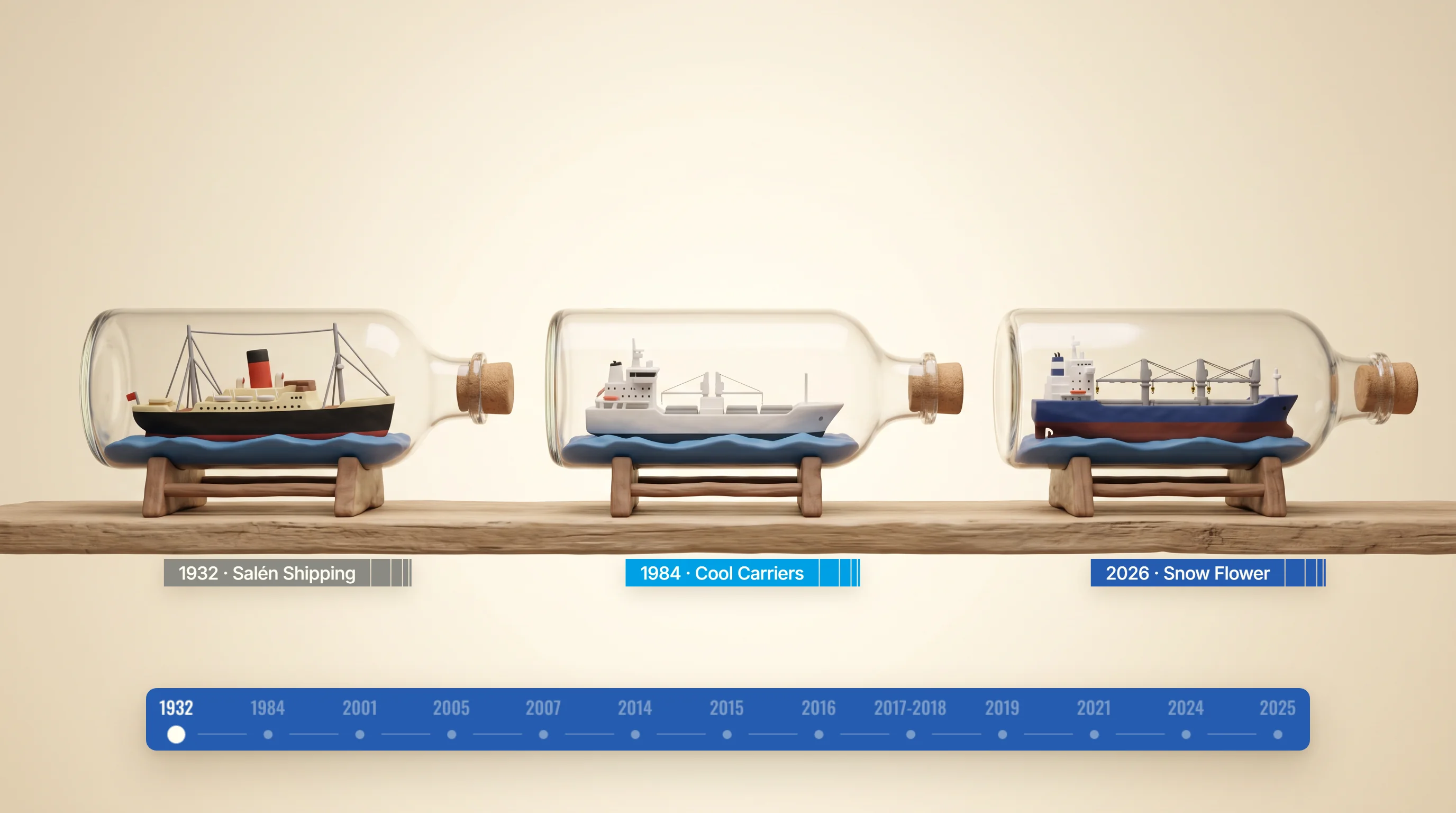
The brand dates from 1984, its roots from Salén Shipping in 1932. On the new site, the History timeline carries that story through to Snow Flower, built in 2026.
Goals
- 1Show the company's scale, heritage since 1984 and key messages.
- 2Answer due diligence questions of partners, investors and regulators.
- 3Help shippers find routes, vessels and regional agents.
- 4Replace regional sites with one site in English and Spanish.
Challenges & How We Overpowered Them
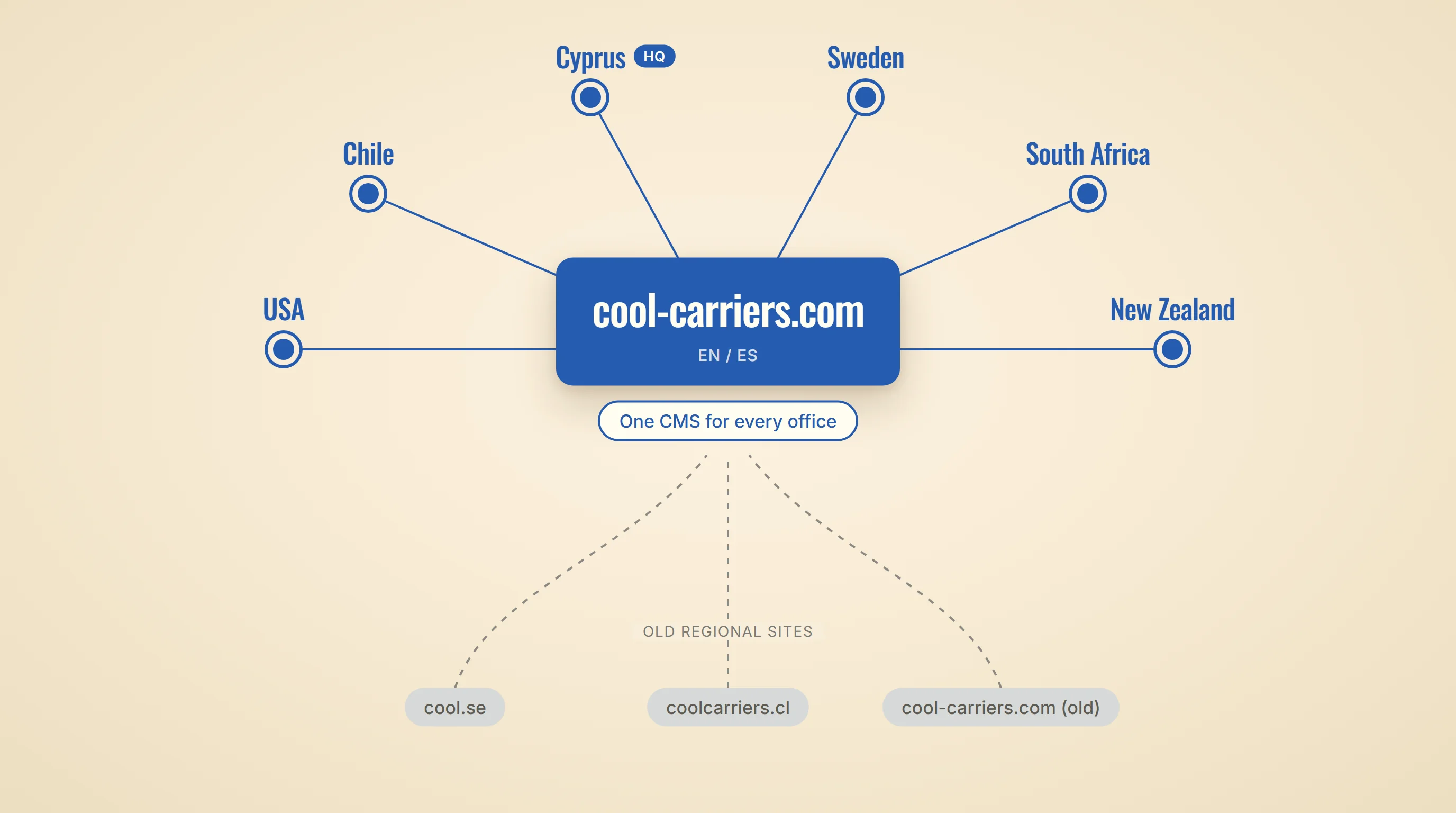
Before: cool.se, coolcarriers.cl and the old cool-carriers.com, each built its own way. Now all six offices, from the Cyprus head office to New Zealand, publish to one new cool-carriers.com.
Design
Design concept
We started with a design workshop. The shareholder joined to align on style early.
Concept v2 was approved two weeks later. It set layout, colors and fonts for all other pages.
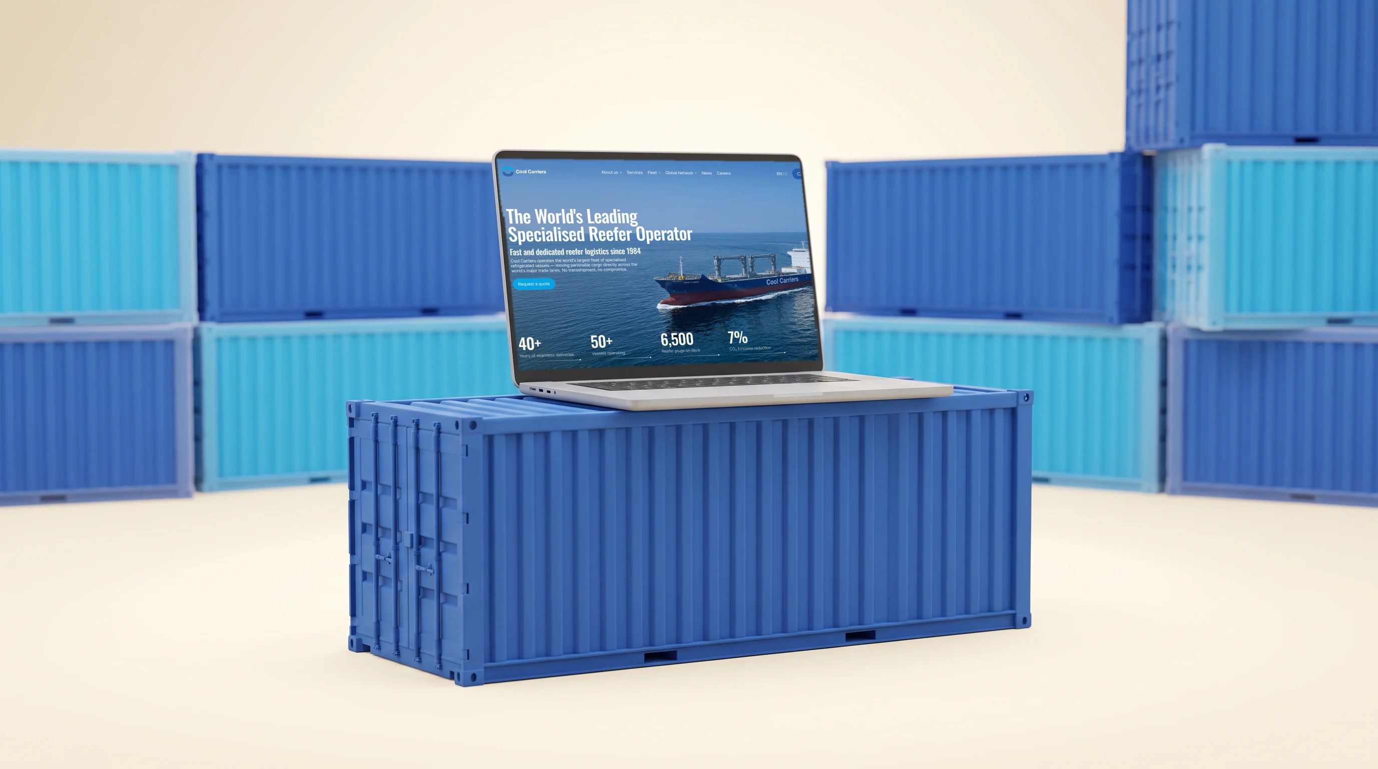
The home page leads with a real ship, Snow Flower, and four figures beneath it, so the company's scale reads before the first paragraph.
Design system in Storybook
The designer assembled every screen from Figma components and variables — reusable elements and shared values for colors, fonts and spacing.
We moved these values into Tailwind as design tokens and built a UI kit in Storybook: a catalog of the site's working interface elements, 43 stories in total.
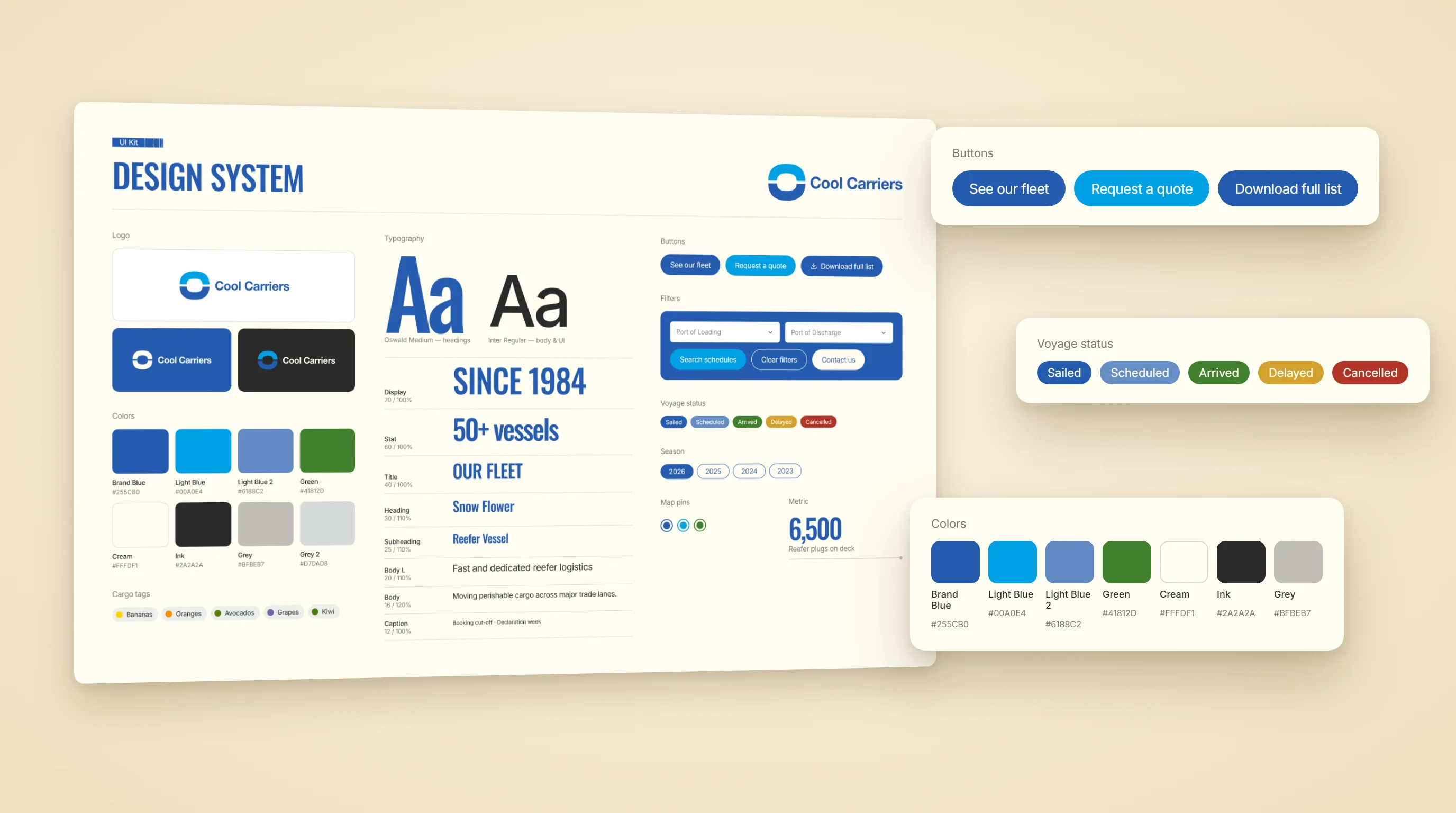
Besides buttons and colors, the kit holds parts only a shipping site needs: voyage statuses from Sailed to Cancelled, cargo tags from bananas to kiwi, port filters.
AI-Native Development
One senior developer and a team of AI agents
One senior full-stack developer with a team of AI agents built frontend, backend and infrastructure. The agents worked in parallel: one laid the foundation, others built pages, each in its own branch. The developer set the tasks and checked the results. This is how we develop now.
The agents worked with full project context: specs, meeting transcripts and the client's API docs lived in the repository, next to the code.
Every change went through one loop:
- one task, one branch, one pull request;
- "done" meant checked on the target environment, not just a green CI;
- a separate reviewer agent with no chat history checked the code with fresh eyes;
- nothing merged into the main code without a person's explicit approval.
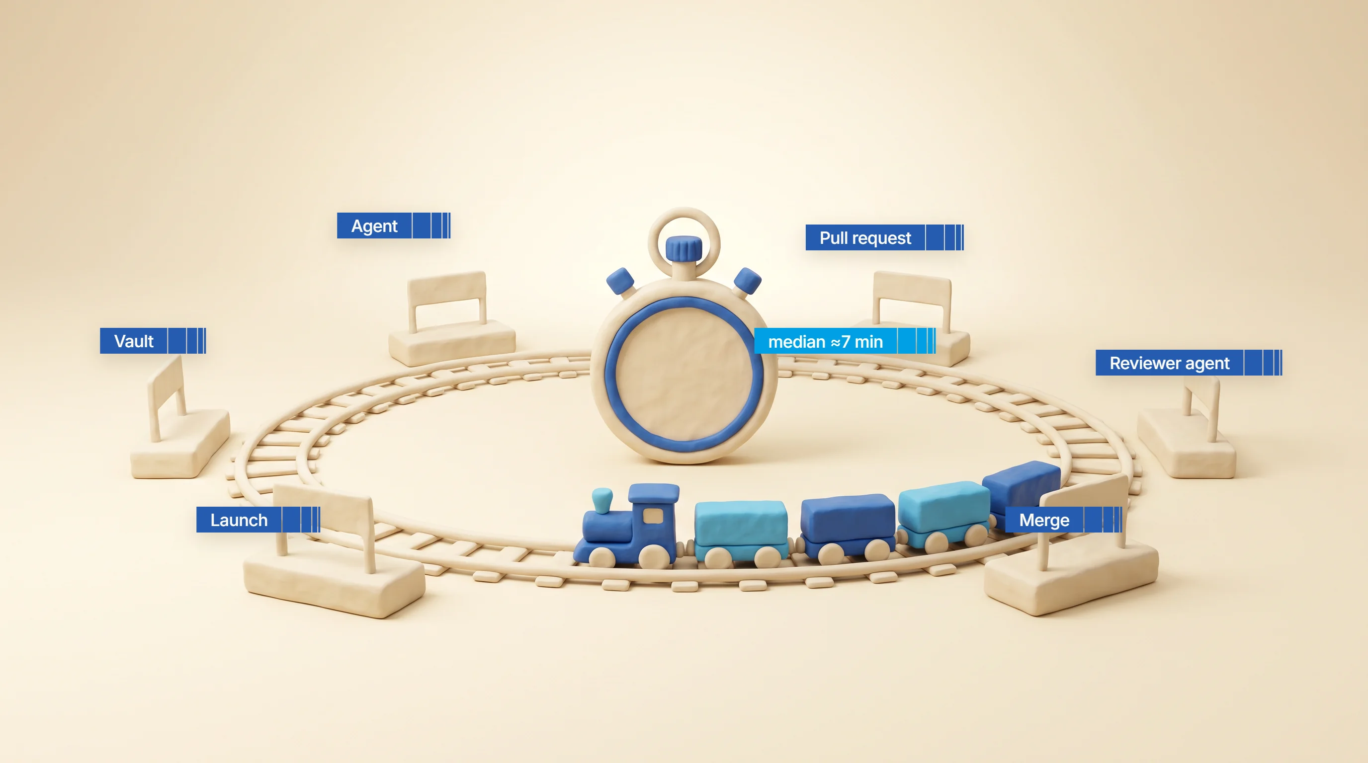
Every change ran the same lap, from the project vault to merge. The stopwatch marks the median: about seven minutes from opening a pull request to merging it.
Pixel-perfect build from the Figma design
The agents coded every page from the Figma design. Pages are pixel-perfect: the same sizes, spacing, fonts and colors as in the design.
We accepted layout by numbers, not by eye: an agent measured the DOM of each rendered page in Chromium and WebKit and compared it with exact values from Figma. This caught, for example, a 38 px box that should have been 28 px.
Fixes used design tokens only, never hard-coded numbers. Change a token once, and it changes everywhere on the site.
Every page was checked at three widths: 375, 768 and 1440 px — phone, tablet and desktop.
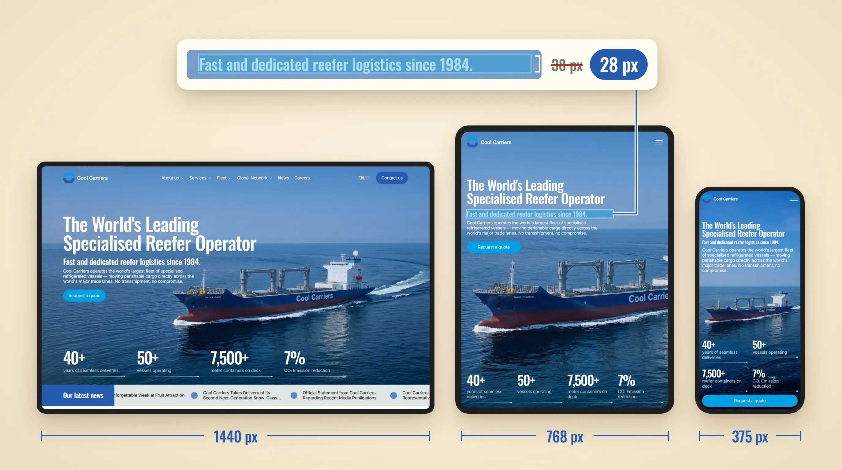
One home page at three widths, drawn to scale. The zoom shows the check run on every page: a box's measured height against its Figma value, where a 10 px slip is invisible to the eye.
Why we chose Payload CMS
A CMS is the system behind the admin panel, where editors change the site's content. We chose Payload CMS because it suits AI-native development.
An AI agent works best with what it can read and change as text. In many CMSs, content structure is set up by clicking through the admin panel. In Payload, it is code.
However, the client's editors get a regular admin panel with forms and buttons and change content without a developer.
Website Features
Fleet catalog
The fleet sits in one table with search and filters by year, CBFT, SQM and containers. CBFT and SQM measure cargo space, in cubic feet and square meters.
A vessel opens in a popup with photo and specs. The full fleet list downloads as PDF. On mobile, the table turns into cards.
A separate page covers the newbuilding programme — new vessels being built for the fleet.
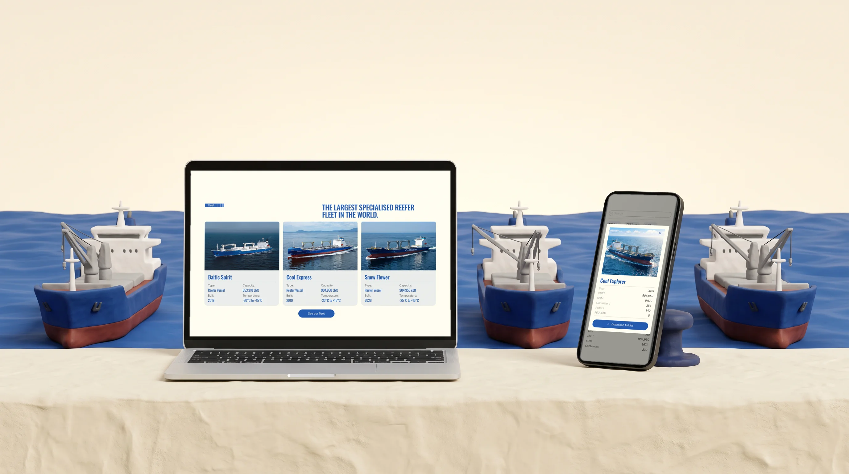
Next to capacity, each vessel card lists the temperature range its holds keep — down to −30 °C on Baltic Spirit and Cool Express.
Chile tools
The Chile page got three tools — schedule, BAF archive, client portal link. They were not in the original scope. We added them mid-project at the client's request.
The schedule filters by trade, ports, vessel and season. Pick a port of loading, and the list of discharge ports shows only destinations reachable from it. Results export to PDF with the legal disclaimer.
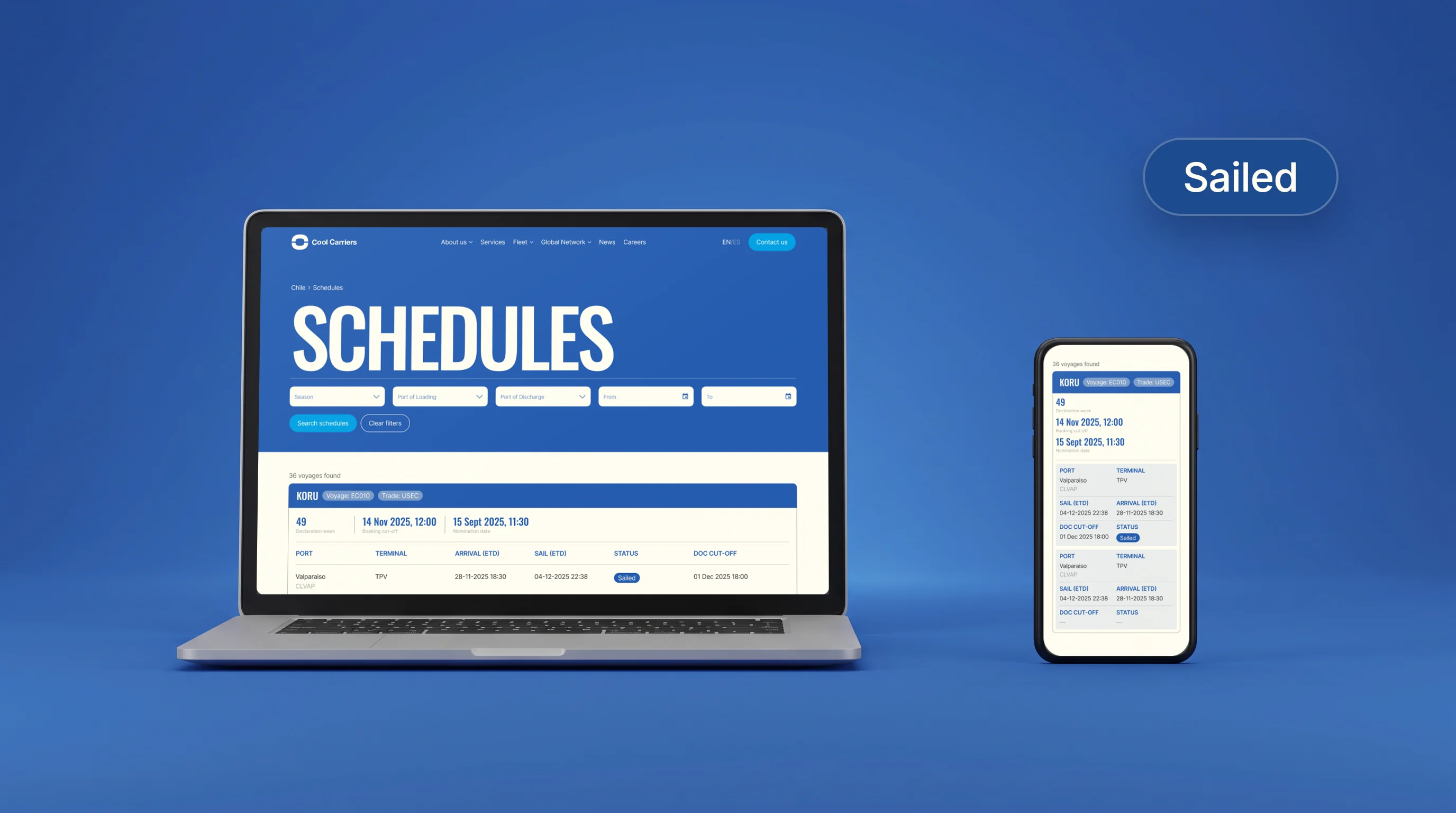
Exporters plan around cut-offs, not just sailing dates: each voyage shows the booking and document cut-offs, the declaration week and its status.
Content management
Editors change texts, photos, vessels and vacancies in the admin panel.
Content sits in 12 collections and 11 page globals. Collections hold repeating items: vessels, offices, vacancies, news. Globals hold the content of single pages, like Home or Careers.
The Chile team updates the Spanish version directly. Contact and quote forms route requests to the chosen office; recipients are set in the admin panel.
Compliance & Security
Results
- 1One website in English and Spanish replaced the regional sites.
- 296 days from first commit to launch at cool-carriers.com.
- 3957 automated tests at launch.